Latest from blog
15 +
Years experience
160 +
Satisfied Clients
80 %
Completed projects
54 +
Success Projects
Project Overview
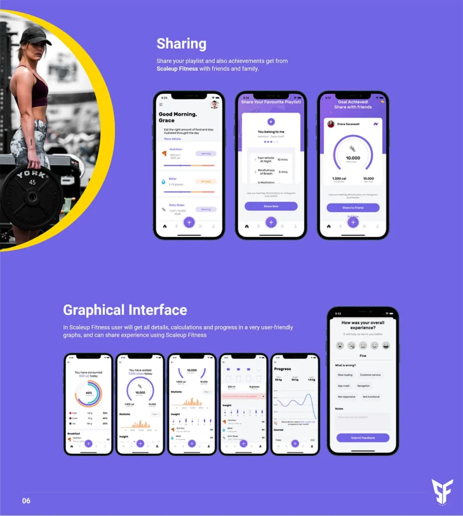
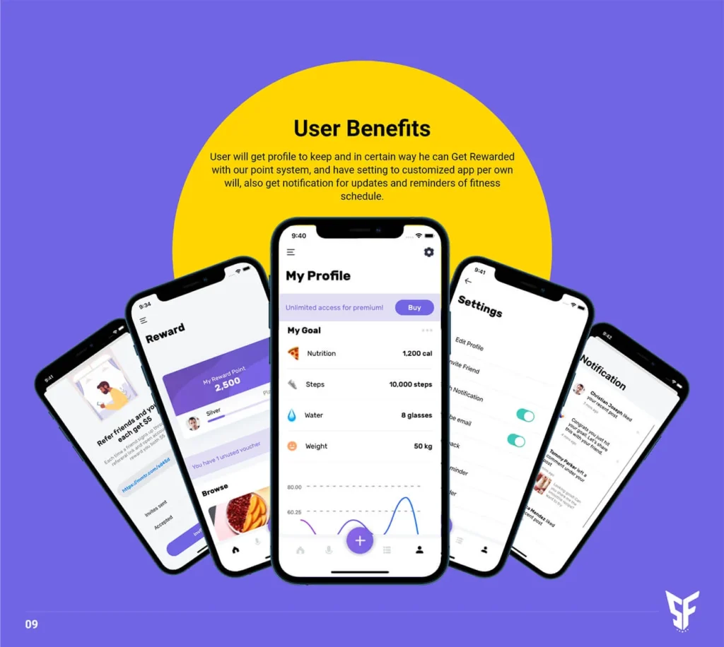
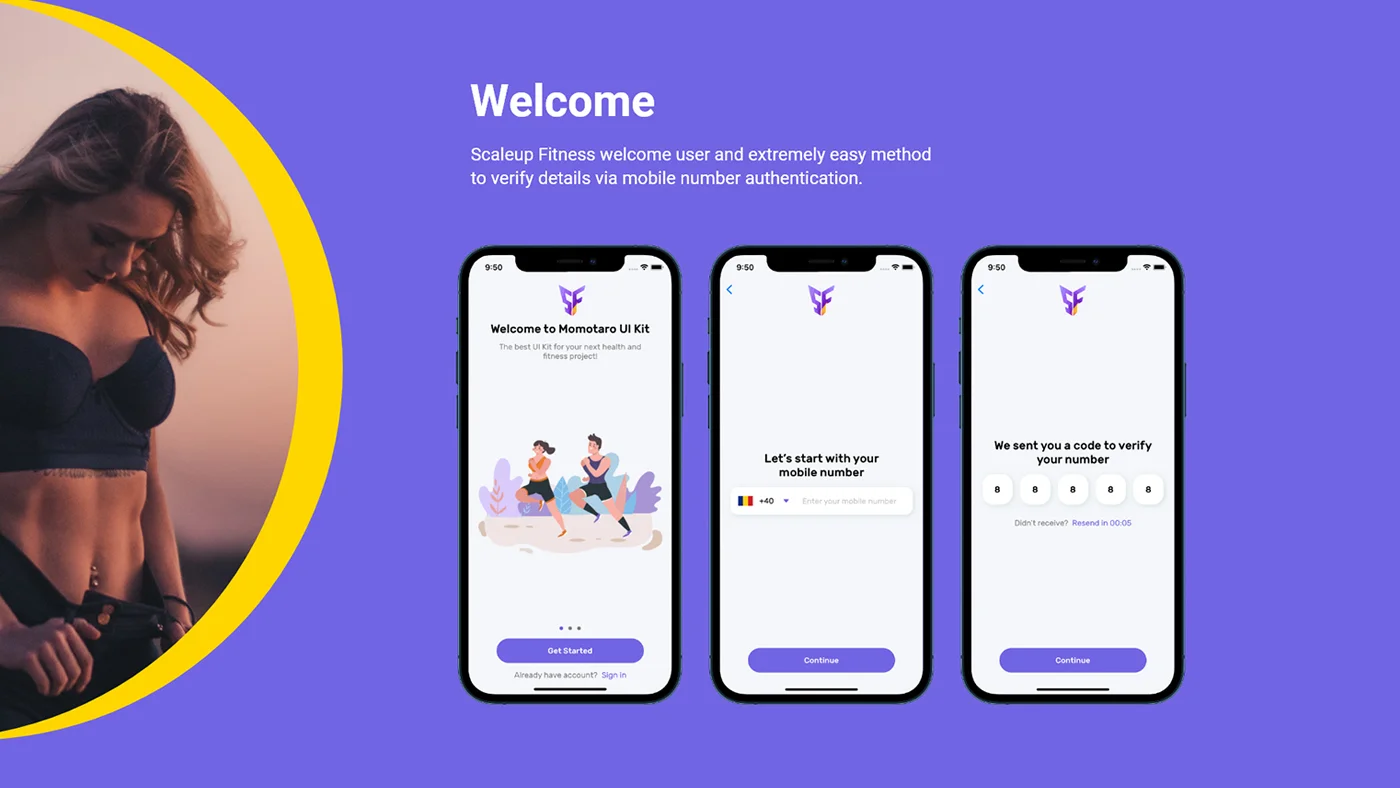
Scaleup Fitness is a fast-growing fitness company that offers a comprehensive fitness app to its users. With features such as daily fitness lessons, diet food details, a supplements store, and a health tracker, Scaleup Fitness aims to help individuals achieve their fitness goals conveniently. This case study explores how SpringRedux, a creative design, assisted Scaleup Fitness in rebranding their visual identity by providing logo design, brand guidelines, and presentation design services.
Scaleup Fitness had developed a robust fitness app with a wide range of features. However, they recognized the need for a stronger brand identity to effectively communicate their values and attract a larger user base. They approached SpringRedux to revamp their visual identity and create a cohesive brand experience across all touchpoints.

Passionately Creating Design Wonders:
Unleashing Boundless Creativity
Date
From April 2024
To January 2025
Executors
Emma Miller
Paul Trueman


Transforming Ideas into Stunning Visual Narratives that Captivate and Connect


Objectives
- Develop a compelling and versatile logo that reflects Scaleup Fitness’s mission and resonates with its target audience.
- Establish comprehensive brand guidelines to maintain consistency in visual elements, typography, color palette, and overall brand expression.
- Create engaging presentation designs to effectively communicate Scaleup Fitness’s value proposition to potential investors and stakeholders.

Approach
iShop is a grocery shopping and booking app for the US market. The app offers a quick and easy way for people to reserve their bookings in restaurants, take appointments from their local businesses like mechanics, dentists, veterinarians, and buses.
Logo Design
SpringRedux conducted extensive research on the fitness industry, competitor logos, and user preferences. Based on the insights gathered, multiple logo concepts were created and presented to Scaleup Fitness. Through iterative feedback and refinement, a final logo was chosen that captured the brand’s vitality, dynamism, and commitment to fitness.
Brand Guidelines
To ensure consistency in Scaleup Fitness’s visual identity, SpringRedux developed comprehensive brand guidelines. These guidelines included specifications for logo usage, color palette, typography, imagery style, and tone of voice. The guidelines served as a reference document to maintain brand consistency across all future design collateral.
Presentation Design
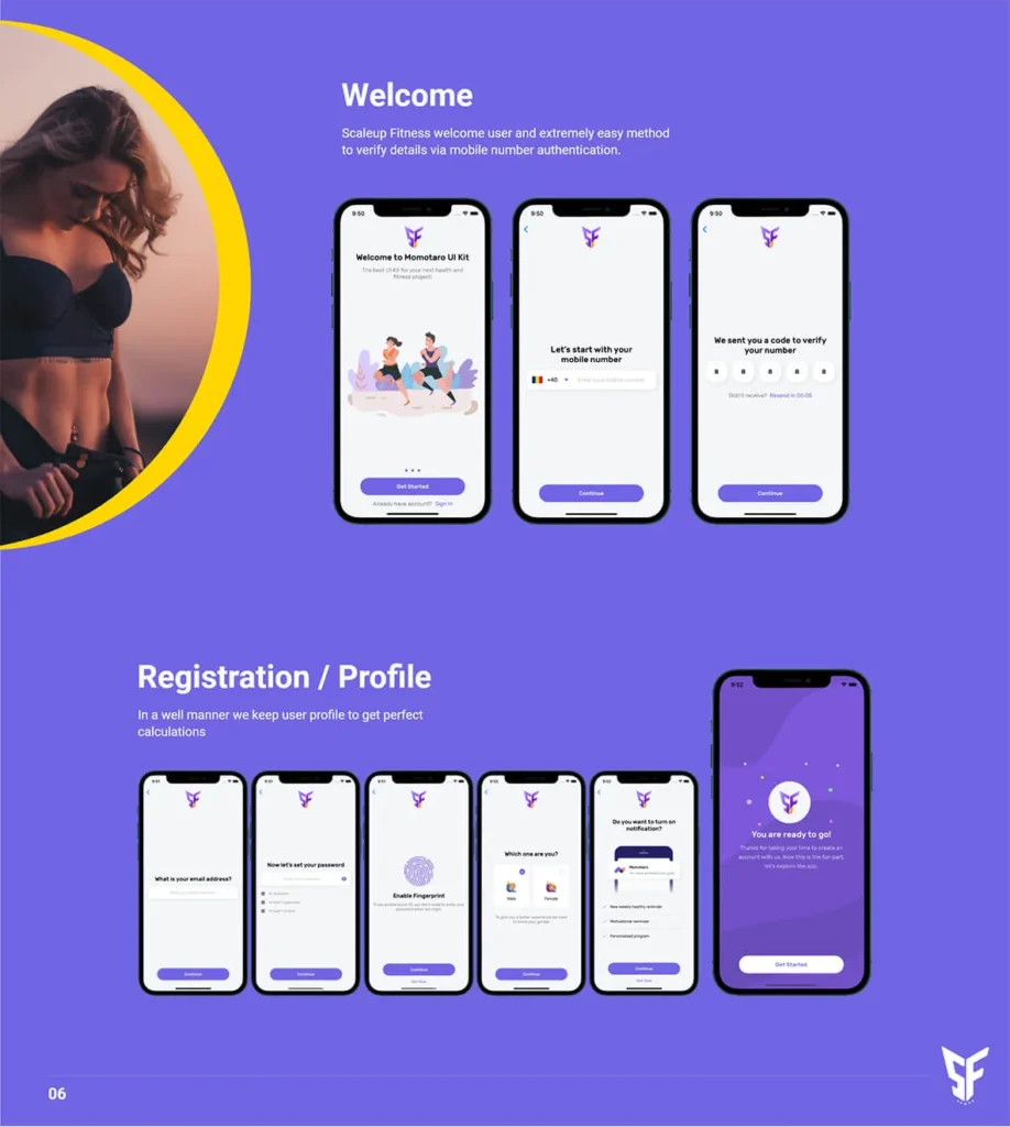
SpringRedux created visually appealing and informative presentation designs for Scaleup Fitness. These designs showcased the app’s features, benefits, and growth potential. By employing compelling visuals, clear messaging, and intuitive layouts, SpringRedux helped Scaleup Fitness present a professional and persuasive case to potential investors and stakeholders.
Result
Through their collaboration with SpringRedux, Scaleup Fitness successfully revamped their visual identity, reinforcing their brand in a highly competitive fitness market. The logo design, brand guidelines, and presentation designs provided by SpringRedux played a pivotal role in creating a consistent and compelling brand experience. With a refreshed identity, Scaleup Fitness was able to attract a larger user base, secure investments, and position themselves as a trusted fitness app in the industry.
